Using one of my images of my sculpture, i duplicated it and placed it in the corners of the page. Trying to create an interesting background.
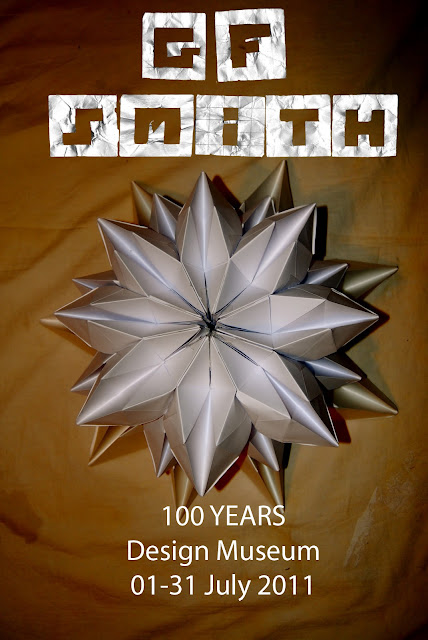
I combined the paper type I made with the background image, however I straight away knew that the whole design would look too busy and not clear enough to the viewer. And so I removed the corners images from the background, to create a clear poster.
I also added digital type from photoshop. Just to give the poster a neater finish.
These are my final outcomes. I was reasonable happy with my designs, however believe that they are quite simple and not very interesting. I'm going to take out my best parts of the poster, for example the hand made paper Type and experiment it with some other imagery.


No comments:
Post a Comment