Wednesday, 30 March 2011

Storyboard Idea....

This is a draft storyboard of my animation. Showing the main scenes in it. The narrative of is, that it starts with 1 tropical bird, flying in the air and then joins a lady tropical bird. They then start to dance to the music and dance in a brazilian carnival way. Moving from left to right, up and down etc. Then the finally few scenes show them bumping into each other and third tropical bird appears!

All the colours combined, shows the colours of the brazilian flag. I wanted to keep that brazilian feeling to the animation as its included into the song.


During the illustrations, I not only looked at body movements in music videos and animations, I had to research bird movements! Like there landing and also how to illustrate them in different frames.
Here are a few videos of the other things I researched to create a draft storyboard. I believe for my final animation, I will be creating a illustrated animation, with frames around of 360/400.


This is how I would want my first few frame to be like. A bird similar to this flying in the sky.


I found this video very helpful! It shows how to draw each frame for a bird flying. Which is perfect because the start of my animation includes a bird flying! 


Motomichi Nakamura

Motomichi Nakamura is a Brooklyn-based digital artist who has worked in as many different media as he has different countries. His animations and paintings, each crafted from a palette of black, white and red, portray playful and bizarre characters who confront the dangers and pleasures of their abstract landscapes.


I really like his work, because a animation of his includes birds. And so researching his work may help me create my animation, making it simpler and fun as well as one with the music in the background.


Here are a few examples of Motomichi Nakamura's work, including a animation which I loved and apparently was quite simple to make, once he had decided on the basic shapes. He used Flash software via computer to create simple shapes of objects and then multiplied them to create lots more. 


MORE Movement

I wanted to research movement however from existing animations. I wanted to look at the simplicity and basic dance movements which are found funny but cool.

I came across the Pixar movie, Wall-E!! I found this too be really helpful because I've realised if I just kept the dance moves to a minimum of going back, forward, left too right it looks funny. And combined with the levels of beats in the song in my animation, it goes well. I experimented different timings, from when to start the music and when to finish it.


I find this animation very funny and helpful. Because the moves are quite simple and hopefully will make my illustrations for my own animation a bit easier to draw.


Movement!

Because my animation involves a lot of dancing and movement from tropical birds, I started looking at music videos as well as animations to help me draw my illustrations. I looked at  music videos from the artist, Shakira. Her body movement will make it easier to make simple dance movements for my illustrations!


I thought it was only fitting to look at brazilian carnvial dances. Because the music in the animation sounds brazilian and i thought it'll be cool to have a animation which includes tropical birds doing a carnival dance in a human like way!! 


My Old Rayograms

We had a workshop session on Rayograms. And these are a few examples of Rayogram photography which i've done in my Alevel photography. I wanted to show the different types of Rayograms I've done in the past. Also to remind the different techniques when making a rayogram.  I loved how the detail came out on some of the rayograms, for example the 20 pound note. I used different objects such as leafs, hair clips and normal paper.


A photogram is a photograph made without a camera by placing objects in direct contact with light-sensitive paper. Upon exposure to light, the paper records the contours of the objects and their textures. Victorian photographers such as W. H. Fox Talbot used this technique to produce delicate impressions of leaves, lace and flowers. These were admired for their detail and clarity.


I then placed another piece of photographic paper on the top of the original rayogram, shiny side down. Which I found created a white and black rayogram.  


Using a leaf and hair clip, I wanted to make a unusual photogram, as if it looks like a tree.  


With this rayogram I wanted to give the impression that the torn up paper is fire and my hand in the rayogram is getting burnt.


AIMZ & G'S Animation


Reptar's Revenge (Stop Motion Animation) from Aimee Scott on Vimeo.

Aimee Scott edited the original animation and included some music and edited the contrast.

Stop Motion Animation - AIMZ & GURTEKHS

This is my first attempt at a stop motion animation. We had a workshop session, where we were put into groups and using toys we had to make an stop motion animation. I found it very enjoyable and quite simple to do. I love messing about with the toys and moving them in different processions.

It opened up my options when making my own animation, whether to do it simply from illustrations or from stop motion.


Aimz & Gurtekh's First Stop Motion Animation from Aimee Scott on Vimeo.


 The storyline of my animation is basically a fight between two toys. We wanted to create a good effect of movement into the punching etc and I believe the stop motion gave that effect.  


Sunday, 27 March 2011

Typographic Animation

I came across this music video from the singer, Kate Nash. I thought it'll be relevant to include into my blog, seeing as the project is on animation and the music video is a animation. I like the simplicity and how effective adding the lyrics onto the animation looks.


I also came across this music video by Jay Z. I really liked how the typography formed imagery. I like this idea, because I might consider applying typography into my animation. And the typography will be my lyrics from my song, perhaps. 

Saturday, 26 March 2011

Animators

When I first saw this brief on animation, I instantly thought of Pixar, Disney and Dreamworks. The creators of Toy story, Shrek, Ice age and mulan. However as I was researching animators, I came across some really interesting pieces of animations. Such as Stop Motion, Flip books, 3D Animations and even music video animations, with the use of typography.

Here are a few examples of animations I found to be really interesting and may be helpful when making my own animation. 


This is Type animation of the song by Citizen cope. I love how they incorporate the lyrics of the song to make an actual animation from it. It's genius, because its a simple idea however it looks very effective. 


This a street animation by a group of artists called BLU. I love there ideas and how they make it into a animation, with such good sound effects, making it look realistic. 


This is a flipbook animation of the martix. I think this is very good type of animation. One which i may incorporate into my own animation. Because i love illustrating and so creating a flipbook animation may be the best idea. we'll see. At the moment I am going to just experiment with different types of animations, seeing which works best with my narrative. 


This is a very simple looking animation from the creators of Pixar. It is so iconic and looks very effective. I believe the more simple you make the animation the more realistic it will look.


Tropical Birds

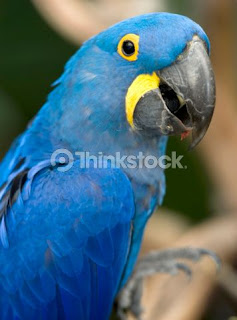
After listening to my allocated song, I picked out a few main words from my spider diagram and then tried creating quick simple ideas for an narrative for my animation. So for example from the word 'Brazil', which I felt the music came from as it was Portuguese. I then picked out things which related to the country Brazil, for example Tropical birds.


I liked this idea of using tropical birds because the animals and very bold and colourful and it goes well with the song, 'Solta O Frango'. I then started researching existing animated birds from pixar and warner brothers etc. For example Tweety bird and Donald Duck.


I came across a new pixar film called 'Rio'. The characters are tropical birds, determined to teach another bird how to fly!


I think this pixar film, Rio, is really helpful because hopefully it'll show me how to make my characters look more simpler as well as bold and colourful as well as funny looking. I had an idea of making a very colourful and vibrant animation where the main storyline consists on tropical birds dancing in a carnival.

I wanted to have an brazilian feel to the animation because it'll relate to my song, with all the clapping and beats. And i think it'll be funny if instead of having humans dancing, i'll have tropical birds.

The main idea was to have one bird flying in the air, and then is joined with a few more birds to then start doing a little carnival dancing in a brazilian style!

Friday, 25 March 2011

My 3 words

MY 3 WORDS!!!!

I then started my idea generation, where I picked my 3 words descriptive, which were inspired  by the song 'Solta O frango'. 


LOVE

COLOUR

HAPPINESS

I then extended more words which related to my 3 words, Love, Colour and Happiness. I started focusing on where the music is based, and i found because its Portuguese, I thought i'll look at its capital place, Brazil! And by looking at things which give you love, colour and happiness in brazil, I found it easier to pop ideas for my animation.

I researched also different facts about brazil, which makes it a fun, happy and colourful place. 


Facts of Brazil:
  • produce the worlds best coffee
  • largest country in South America
  • longest beach at 7500km
  • the worlds second largest river the Amazon is found in Brazil
  • one of the largest Roman Catholic countries 
  • the most species of monkeys,Brazilians love to play soccer
    • Love, colour and Happiness 
    • People, beaches, food, women, animals, birds, blue skies, football carnivals, tropical birds, brazil flag, blue skies,

My Song

The idea is to combine a piece of music to create a animation.

This is the song I have been assigned too..

Solta O Frango:


I first put the song onto my Ipod, so i could listen to it constantly and get a feel for the song. I then draw a spider diagram in my sketchbook, of things which popped out of my head as I was listening to it.


I looked and listened to the colours, the beat, rhythm, objects and instruments. Before looking at the actual video of the song, I did get a warm summers Brazilian feeling. Where's theres a lot of love and happiness in the song.  

These are a few words which came to mind when I was listening to this song:

  • Love
  • Happiness
  • Brazil
  • Green/Red/Yellow
  • Dancing
  • Clapping
  • Techno
  • Football
  • Blue skies
  • Green grass

BRAZIL:


I then started incorporating the idea of the Brazilian feel and looked a bit more into it. Such as drawing little illustrations of things relating to brazil. 

For example: 
  • Rio
  • Tropical birds
  • Beaches
  • Warm oceans 
  • Ice cream
  • Football - Skill
  • Women
  • Carnivals

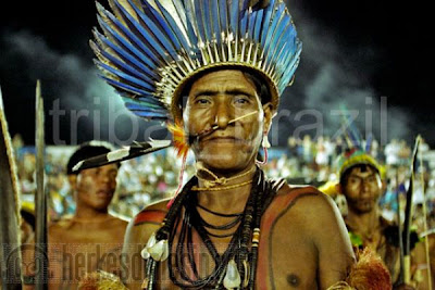
I wanted to research a bit more on the brazilian culture and hopefully giving me a feel of its life style. So here are a few images of brazilian culture...


This is the first idea what came to mind, because I thought it relates to the sound of my song. And so i may incorporate aspects of brazilian culture into my animation. I specially love the bright colours, carnivals, the history in world football and also there tropical birds. I may be able to create some really cool animations of the tropical birds.


Thursday, 24 March 2011

New project: Print to Pixel

This is a new project on Animation. Where I have to make a 20-30 second animation which includes a chosen song from the tutors. I think I'm going to enjoy this project because I've always been interested in animation, such as Pixar and Dreamworks.

Assignment 1 is focusing on the Concept, Narrative and Storyboard. Where we have to create a series of images using skills and processed learned and practised in previous workshop sessions, that can be used to plan a motion piece and represent it with a short storyboard that will give linear view of my animation and it's timing.


Friday, 11 March 2011

Task 2 - FINAL POSTER


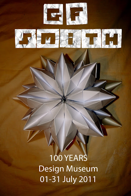
This is my final design for Task 2. A did a similar design in my development a few posts before. However this time, i've used a grid on photoshop to align my text and imagery. To get an accurate final piece, where all the text and imagery are in order. Which as a result, makes the design more professional and neater.

I also spaced out my type, so that it is easier to read. The main reasons I chose this design as my final poster for task 2, is because it relates to GF Smith Paper, as parts of my poster involve paper sections. For example the Type and the '100' type image. Which again I made, from incorporating an idea i had from my final sculpture in task 1!

I also think the use of colours makes the poster look more professional in black and white. As it's strong and simple, making it effective. I wanted the type simple also, to make it easier to read. However by incorporating my own type I also wanted to make the poster interesting. 

Task 2: GF Smith FINAL POSTER

After doing all my research and experimenting with different ideas, I have decided to redesign an poster which i did a few posts ago. The key areas I'm going to make sure is clear on my poster, is that, it's bold, simple, relates to GF Smith Paper and also have a sense of celebration.

Here is are screen prints of development in the making of my final poster.....


The grid, which really helped me place my layers in accurate procession.


I first started the poster by including the '100' paper sculpture I made, aligning it at the top the poster. Because after experimenting different layouts before, I found this layout to look best. I thought it was important to have something which represents paper into my GF smith paper poster, and so the '100' sculpture hopefully works well. 


I then started including my type, which i made. I do think the type ad imagery work well together. As it gives a difference of contrast. 


Task 2: GF Smith Paper Poster Ideas


Here is another poster idea I developed. I'm simply designed a digital poster, using a image of my final sculpture from task 1 as well as digital type using photoshop. I wanted to experiment using different filters and find out how the poster would look. 


Using this photograph I took of my final sculpture from task 1, I edited the filter and then thought of incorporating it as a poster. I especially like how the filter has created a very metallic effect to the sculpture, giving it a metal life quality. 


I then started drawing thumbnails of different designs, I thought would look interesting. I experimented different layouts with the text and imagery. I wanted to make the sculpture and the number '100' the main attraction of the poster. So by enlarging them parts on the poster, I thought it'll look effective. 


I really liked this layout, because the idea was to have the image and text running down the poster. Going from large to small. 


I then started including the information for the GF Smith poster. The information needed was the Age, the name, and date. I thought it'll look interesting if the colour of the type was minimum however colours which will go well with the colour of the sculpture. 


Final Design


Wednesday, 9 March 2011

Task 2: GF Smith Paper Poster Ideas

Here is another poster idea I thought of designing. The examples shown show various different layout and formats. In this design, I inserted my final sculpture from task 1, however altered the design by layering my sculptures on top of each other. As a result creating another interesting paper sculpture.


Using one of my images of my sculpture, i duplicated it and placed it in the corners of the page. Trying to create an interesting background. 


I combined the paper type I made with the background image, however I straight away knew that the whole design would look too busy and not clear enough to the viewer. And so I removed the corners images from the background, to create a clear poster. 


I also added digital type from photoshop. Just to give the poster a neater finish. 

These are my final outcomes. I was reasonable happy with my designs, however believe that they are quite simple and not very interesting. I'm going to take out my best parts of the poster, for example the hand made paper Type and experiment it with some other imagery.